BART to Silicon Valley Phase II Extension Proposal and Branding
A full suite of branding, design and production services provided for a must-win RFP response.
The BART to Silicon Valley Phase II Extension project will be one of the largest infrastructure projects in the SF Bay Area for years to come. With technical details being wrangled for years between BART and the Santa Clara VTA, every large engineering consultant had ample time and extensive plans to win the project. Competition would be fierce. The proposal team I worked with determined that not only the content but the design and presentation of the proposal needed to be “on another level”—not just elevated but exalted above standard, run-of-the-mill RFP response fare.
Identity
The proposing firms formed a joint venture to pursue the bid. As such, a new identity for the JV was needed.
Color Theory
I developed the brand palette as a riff on the similarity between the main brand color used by the lead JV partner, and the main brand color for agency requesting the proposal.
Typography
HK Gothic is a grotesque face in the mold of the classic realist gothics, yet it leans toward a more current geometric-sans feel. It was chosen for its contemporary look, its uncompromising but understated clarity in headings, pleasing color in text—even with the tighter tracking required by text-heavy technical proposal—and its portability across teams as an open-source face.
Team Logo
The logo is always the most obvious part of brand identity, and there had been attempts prior to my involvement to address this aspect. More work remained to be done.
These preliminary logos, done by others, had issues with focus and cleanness
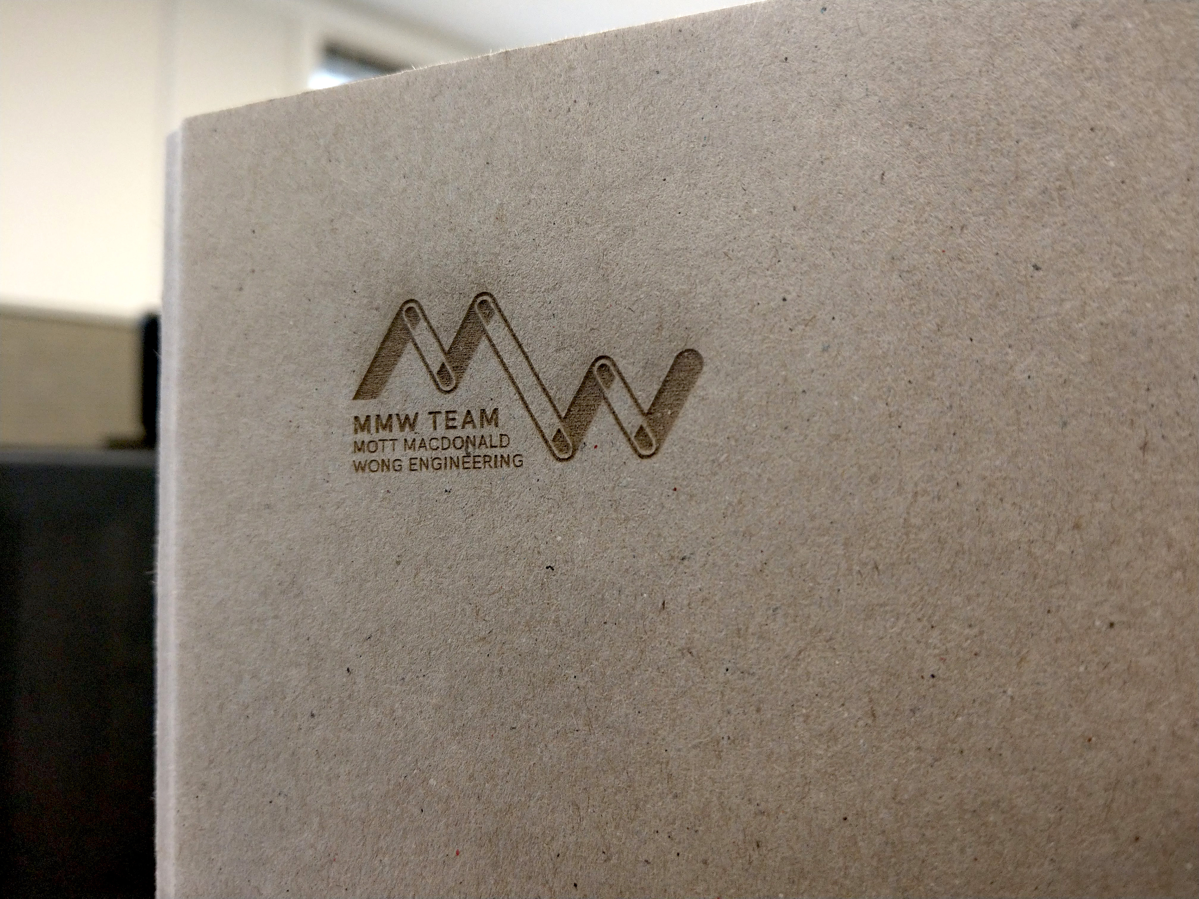
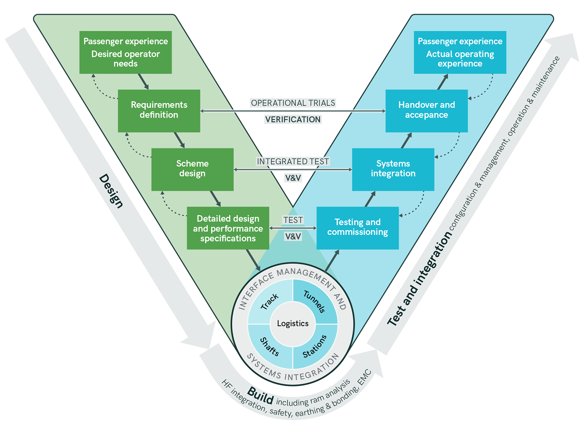
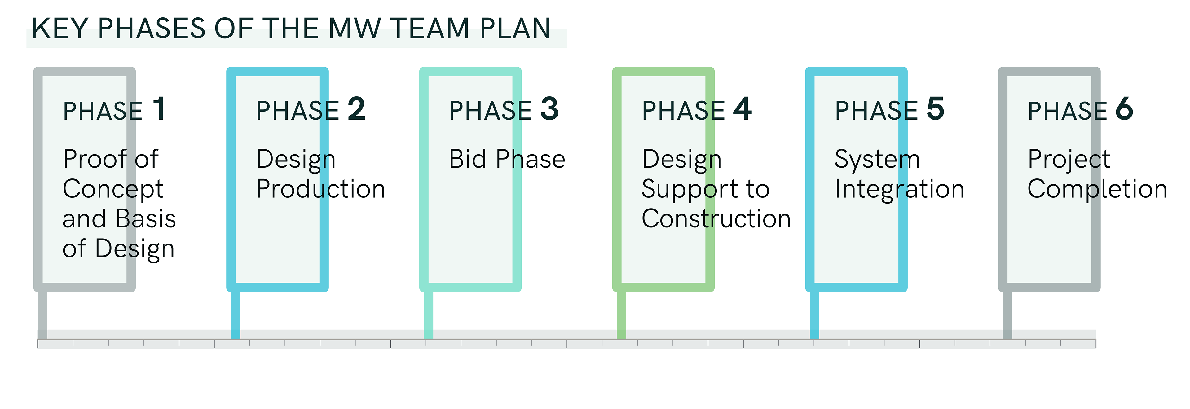
The team identity needed to be clean, strong, vivid and contemporary. I created a new logotype that nods to the "joint" aspect of the joint venture; the interconnected phases of the project; and the above- and below-ground construction needed.
Graphics

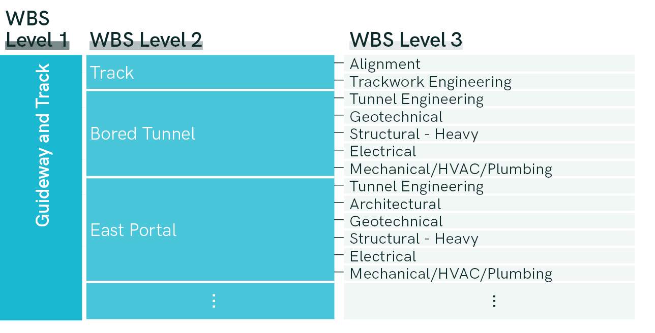
Package Cover and Binding
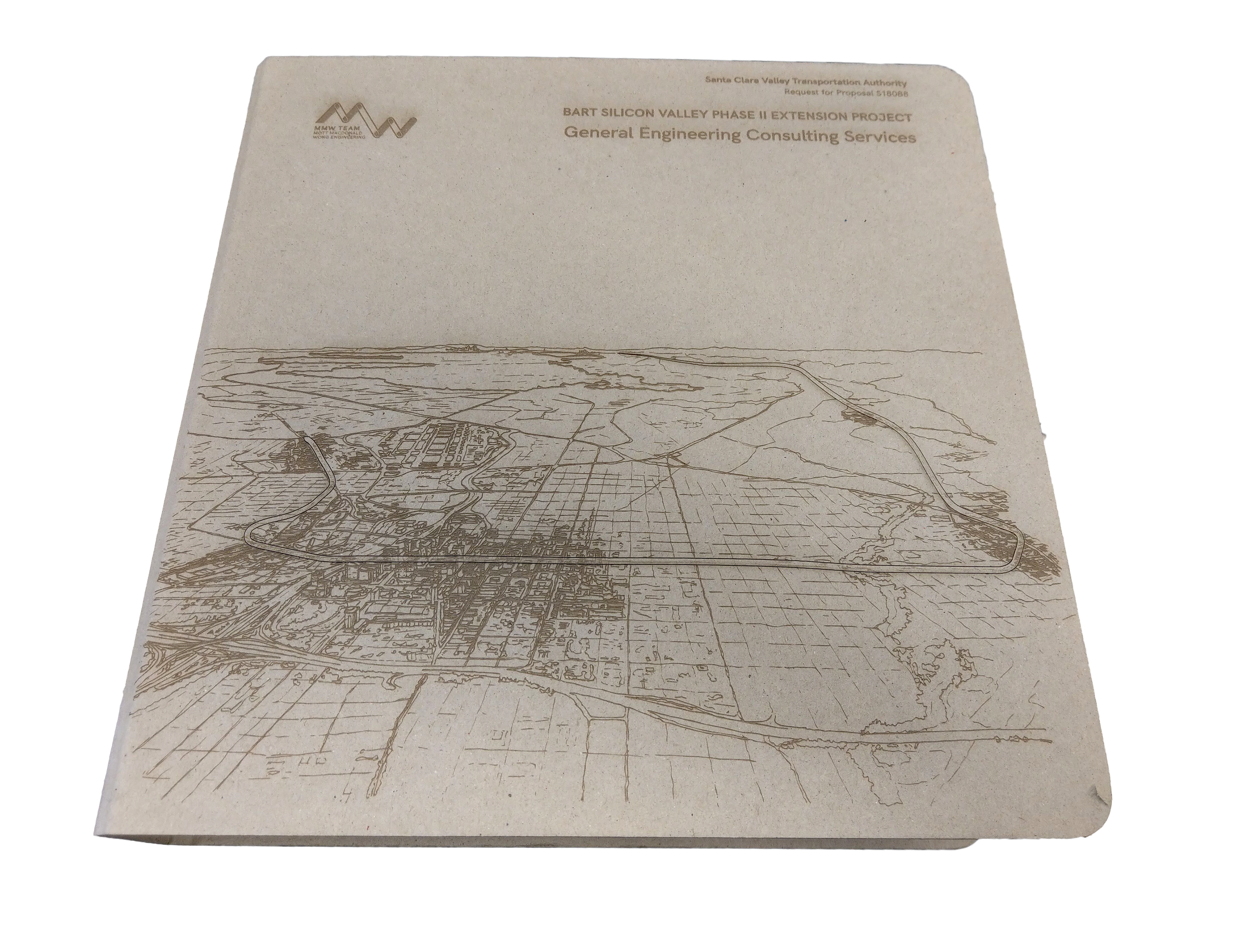
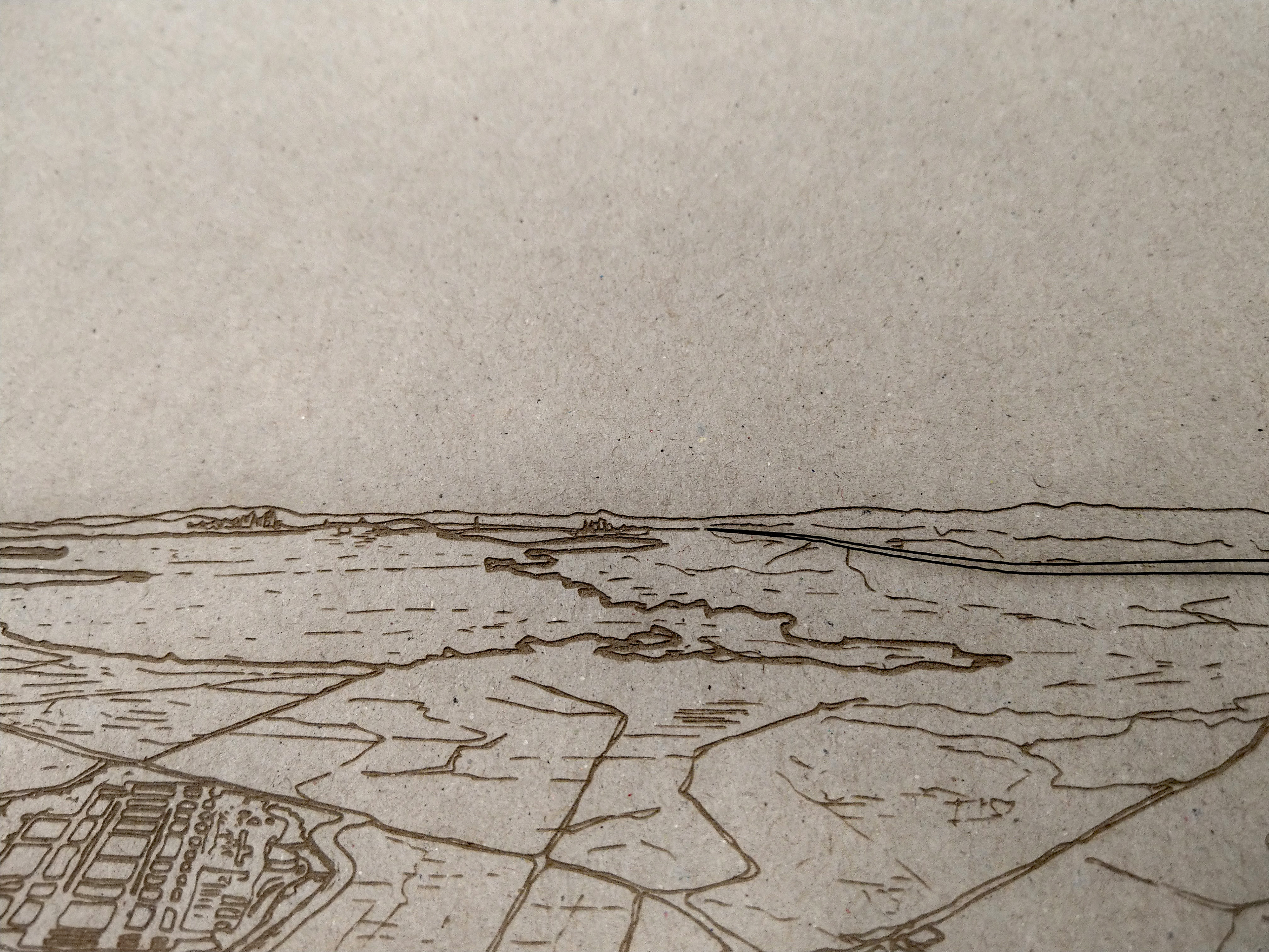
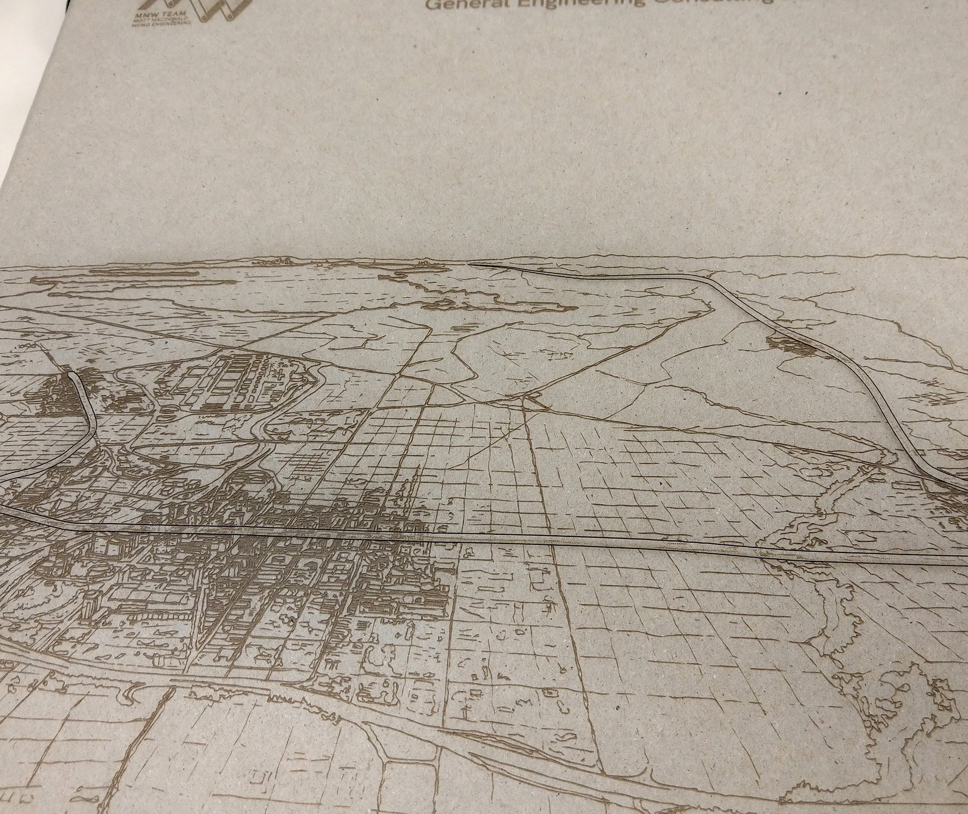
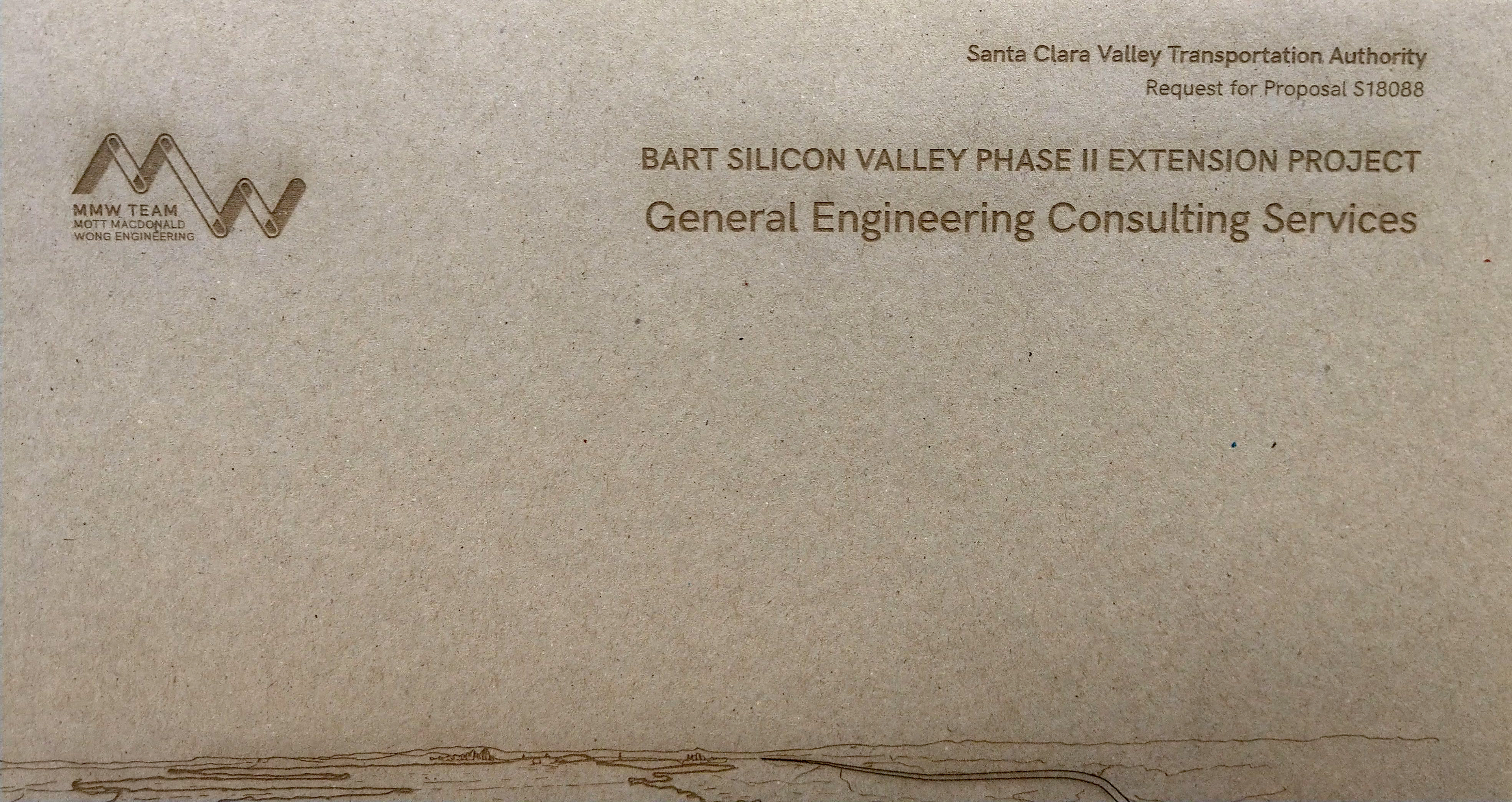
Covers for this proposal needed to be extraordinary. Proposal package covers in the A/E industry tend to be of a very standard type—there is almost always a relevant project photo showing similar work. With this proposal, we wanted to present a vision of the project, and break well away from the ordinary in terms of content, design, media/substrate, and overall ambition.
Cover Artwork
I worked with external resource to create a hand sketch of downtown San Jose with the whole Bay Area shown receding in the distance, capturing the entire area of the project alignment, as a starting point.
One of the architectural lead on the proposal team, a skilled hand drafter, created this sketch
Sketch art vectorized, in sections; I used a mix of automated tracing tools and corrections by hand.
Laser Engraving
I developed a concept for a truly unique proposal binder: laser cutting on a raw pressboard binder. Below, early mockups created to win buy-in from the proposal team.
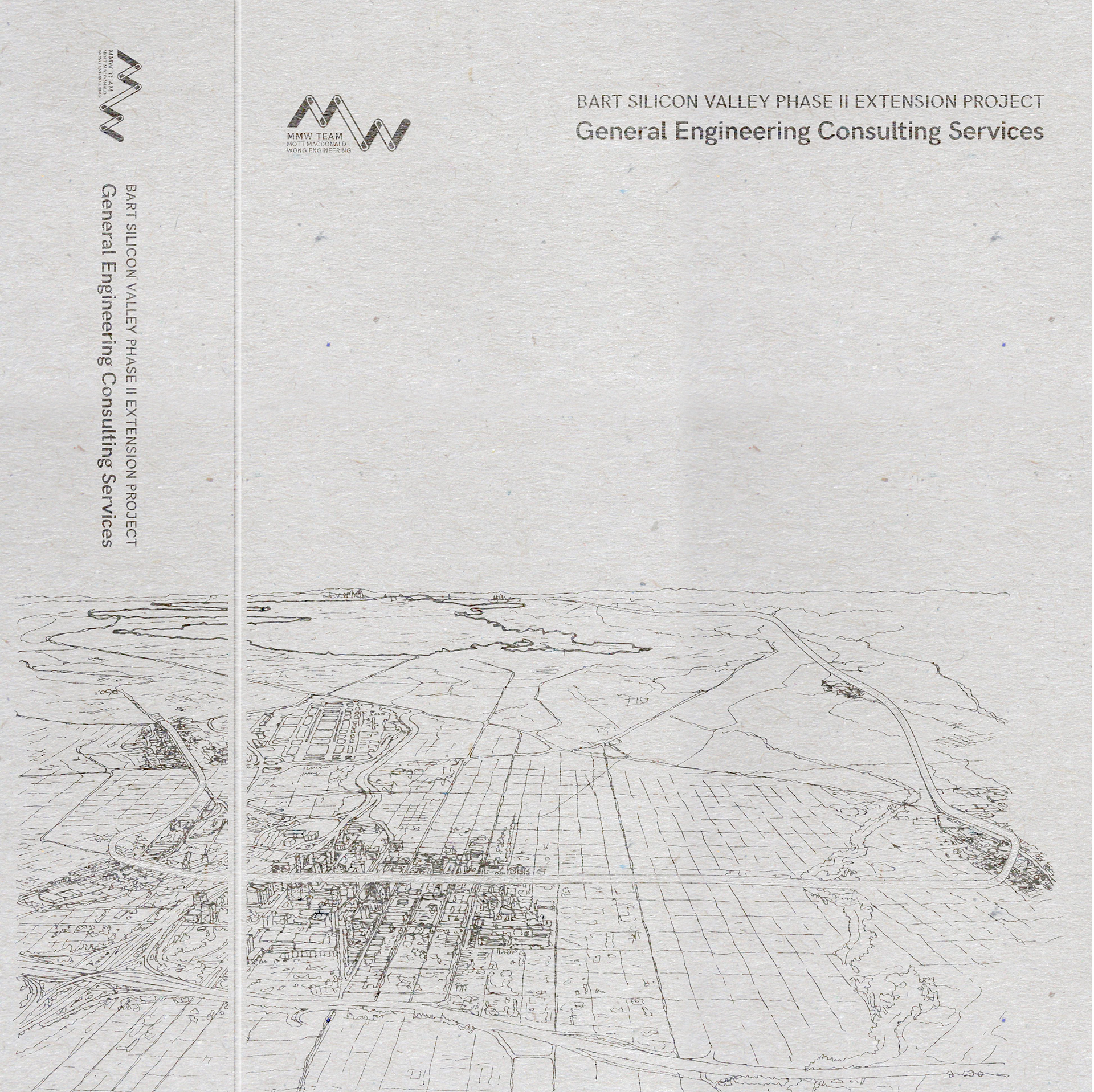
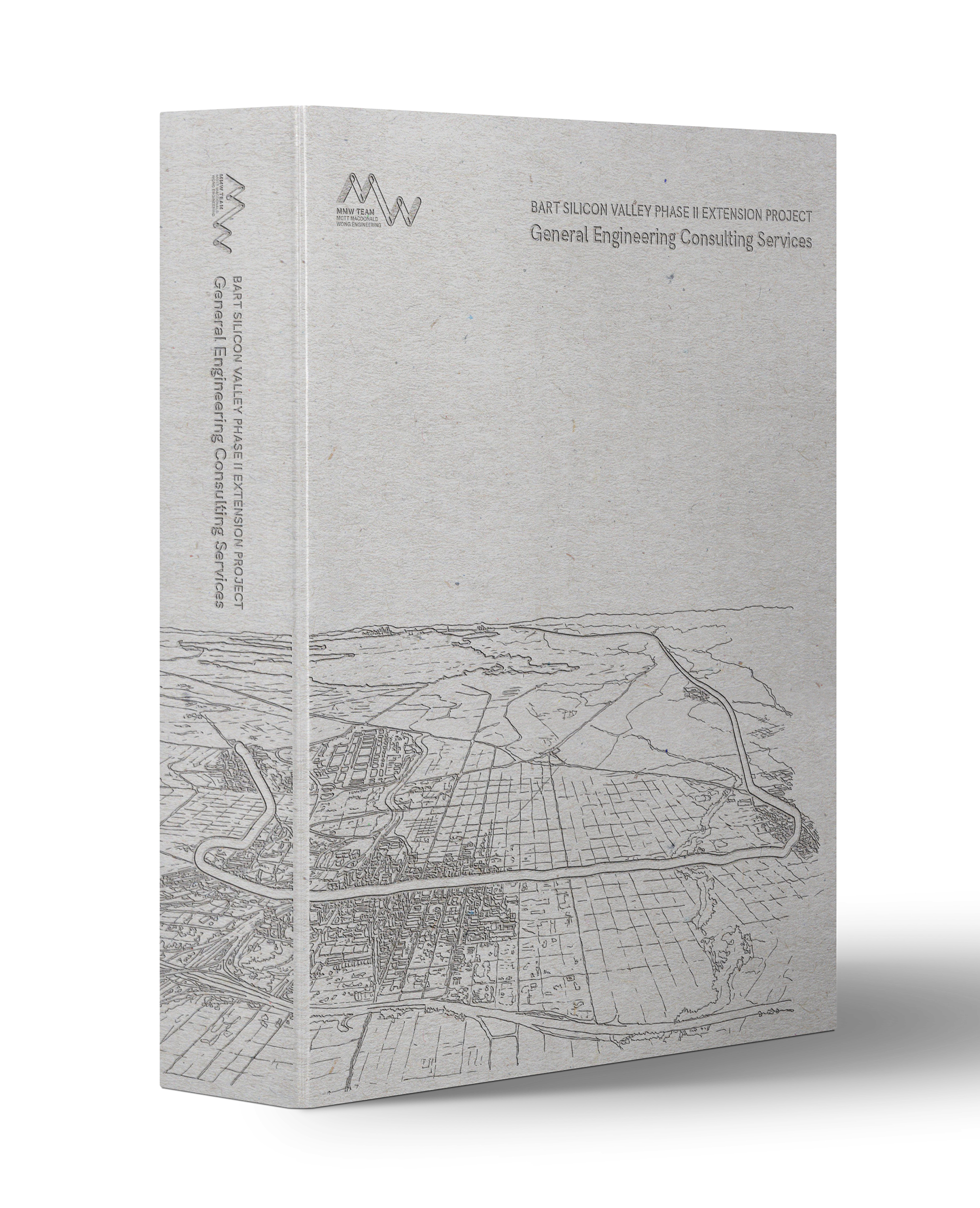
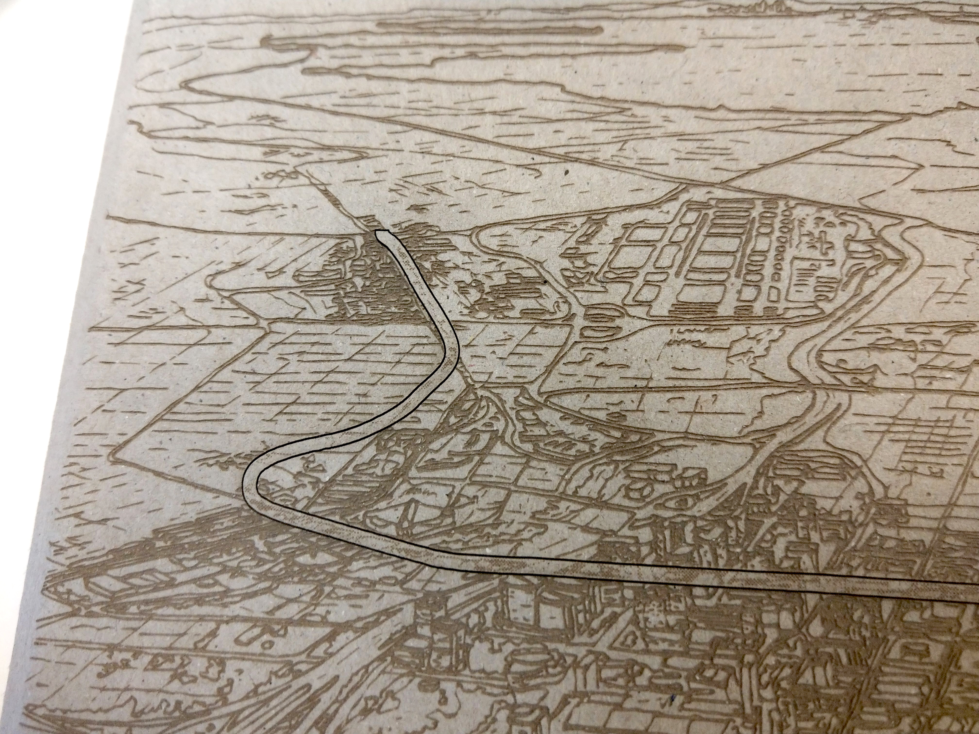
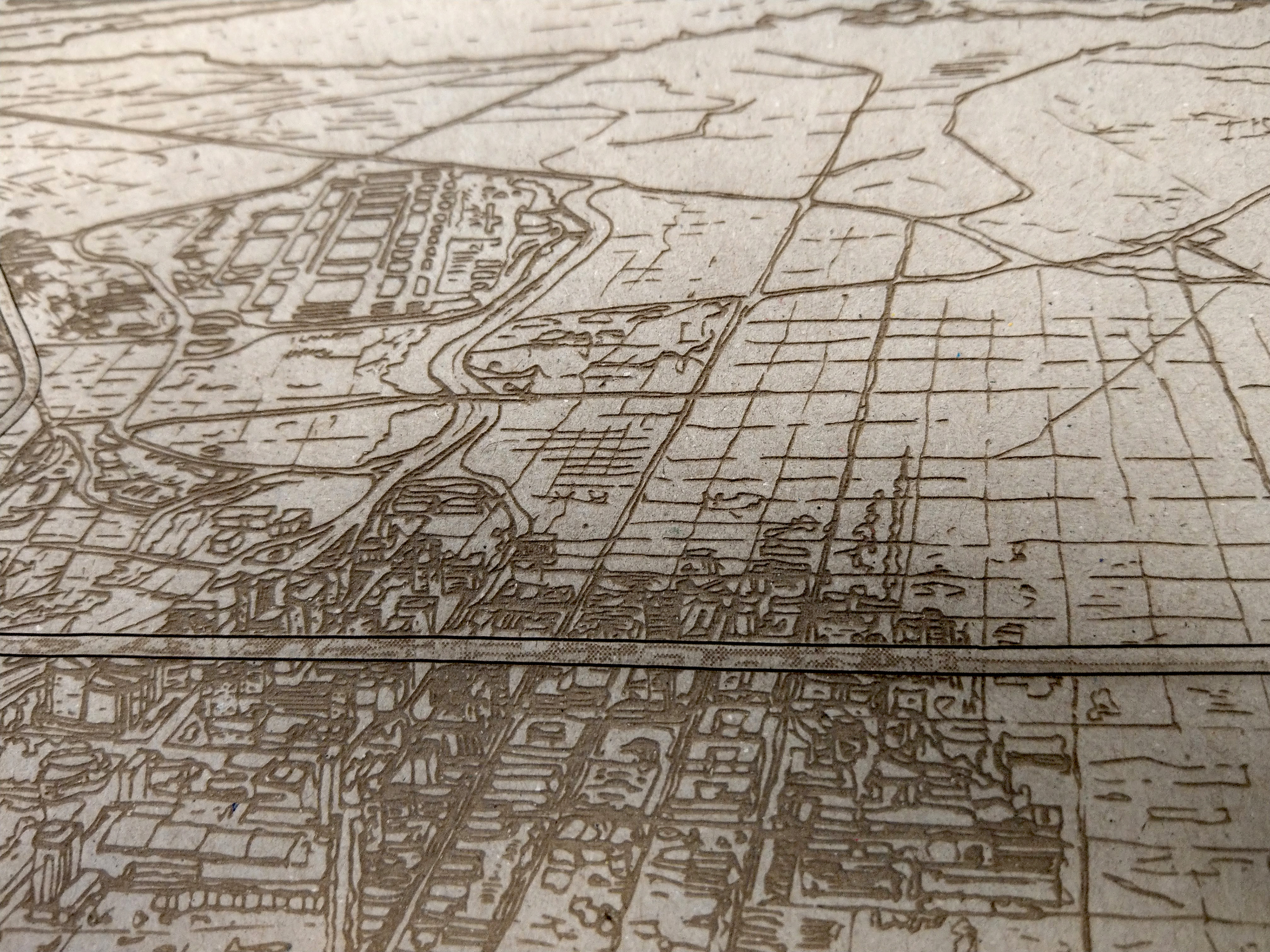
We worked with the outstanding Pagoda Arts laser-cutting studio in San Francisco to arrive at a technically accurate final. The sketch art would be converted to raster artwork for laser engraving, while the project alignment would be retained as vector artwork for heavier, deeper laser etching. Thus prepping the artwork in stages.
Final Binders
